Few marketing projects pack the punch of a logo design or redesign: Your firm’s logo is the primary visual messenger of your brand, appearing on materials ranging from court filings to Koozies.
It’s imperative that a logo reflect your brand identity and personality. But it’s equally important to understand the landscape where your logo will exist – and to build a logo that takes into account client attitudes and preferences, industry patterns and intellectual property considerations.
To be sure, effective logos are more than pretty: They are purposefully designed to resonate with key stakeholders, and they are proprietary and well-protected. Recent research shows how a logo’s construction can affect its performance, and how law firms continue to favor one color over all others; recent additions to the marketing tech landscape pose many traps for the unwary.
Here are four questions law firms and legal service providers should consider in any logo project:
Descriptive or Nondescriptive?
One recent study analyzed nearly 600 logos to determine which was more effective: A logo that portrays an organization’s offerings, or one with more abstract visuals.
Researchers defined “descriptive” logos as those that include textual or visual design elements (or both) that “clearly communicate the type of product or service a brand is marketing.” An example would be Burger King, which literally sandwiches the company name between two buns. In contrast, a “nondescriptive” logo’s design is untethered to the actual product or service; consider the McDonald’s golden arches.
Ultimately, they found that descriptive logos generate more favorable impressions among prospective buyers – and boost the bottom line. The researchers theorized that because descriptive logos are faster for our brains to process, they foster a faster understanding of what an organization does – and a faster connection to it. Compared with nondescriptive logos, their studies determined that descriptive logos:
- Make brands appear more authentic;
- Spark more favorable impressions;
- Increase consumers’ willingness to buy; and
- Drive more sales.
There’s a major caveat for law firms and legal service providers, though: The researchers found that descriptive logos could hurt brands that market products or services associated with “sad or unpleasant things,” like funeral homes or insect repellent. (Or, ahem, lawsuits or divorces or criminal charges.) Here, descriptive logos bring with them the negative feelings consumers associate with the subject matter.
We’ll add a red flag for legal entities considering descriptive logos: Some images are so ubiquitous in the legal industry that using them will make a logo utterly unremarkable. On our no-fly list: the scales of justice, gavels, law books, courtroom steps/pillars, Lady Justice and more. Law firms that want clarity in a logo would be better served incorporating nomenclature like “Attorneys at Law” or “Law Group” into their marks.
Symmetrical or Asymmetrical?
Researchers also have studied how a logo’s symmetry (or lack thereof) can affect market perceptions. Generally, people prefer symmetrical shapes to asymmetrical ones; Harvard Business Review reports that about 95 percent of logos are perceived as symmetrical.
Interestingly, it seems that our minds want to link order (symmetry) with brands we view as stable or traditional, and we expect something more unpredictable from trailblazers. In this study, “exciting” brands actually suffered when given symmetrical logos; the mean rating was 4.9 (out of 7) for asymmetrical logos but 3.9 for symmetrical ones.
While this study did not specifically call out any members of the legal industry as “brands that do not have an exciting personality,” most of us can self-select into this group. In this category, symmetrical logos were found to raise consumer ratings – and financial valuation.
Long before the logo design process begins, it’s imperative to know who you are and what you stand for. An asymmetrical logo can work well for a firm that is doing things a little differently – through technology, a strong niche position, a new pricing model, et cetera. For law firms that lean more traditional, an asymmetrical logo could mean cognitive dissonance with clients and prospects.
Blue or…Not Blue?
An analysis of The National Law Journal’s list of the country’s 500 largest law firms confirmed that blue continues to reign supreme in law firm color palettes.
Indeed, nearly half of law firms, 45 percent, use some shade of blue in their marks. With good reason: Management Decision reports that consumers make enduring decisions within 90 seconds of their initial interactions with a good or service, and “about 62 to 90 percent of the assessment is based on colors alone.” In almost any study of color theory, blue is linked to security, trust and strength.
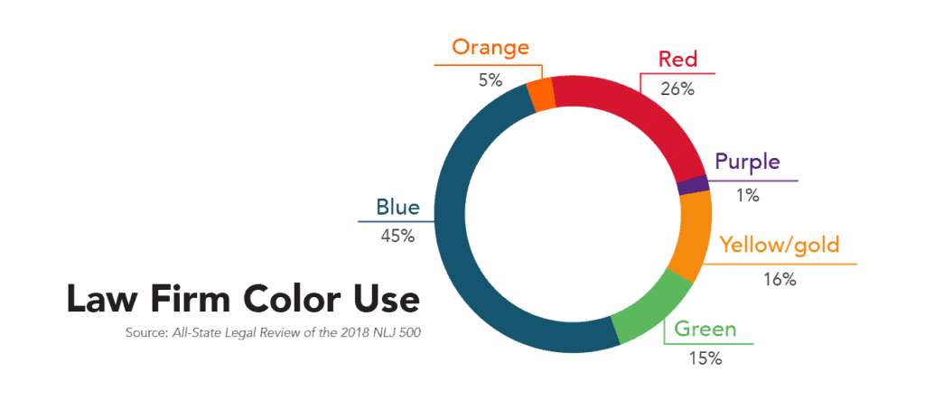
Because red brings such a dramatic feel, almost aggression, it must be deployed strategically. Reds should only be used by law firms that are committed to a brand identity based on swagger and confidence.
Rounding out the primary colors is yellow. Interestingly, yellow on its own accounts for only 1 percent of law firm logos, but when combined with more gold tones, that jumps to 16 percent; law firms favor the prestige or quality connotations with gold over bright, vibrant yellows.
Law firms that want to stand out could look beyond the primary colors to green, orange or purple, but this must be done prudently. It’s critical that your logo hues be chosen with your complete brand identity in mind. Colors should be selected to reinforce your firm’s identity, and as in all things branding, they must be relevant and authentic. Do not pick a color simply because others aren’t using it – pick a color that is unmistakably “you.”
Custom-Built, Crowdsourced or Canva?
Just as legal tech has changed the business of law, a number of marketing platforms have disrupted traditional graphic design offerings. While there are many ways that marketing tech can make it easier to incorporate design into your work, logo development is not the most prudent.
99 Designs, for example, is a website where you can launch a logo design contest. Freelancers submit ideas, you pick a winner, they get paid. How do you know your logo doesn’t infringe on anyone else’s copyright or trademark? You don’t. The company states it clearly on its website: “As a contest holder, the onus is on you to take reasonable steps to check that the winning design in your contest is original and won’t land you in hot water.”
Yes, the onus is on you.
Similarly, Canva makes millions of design elements available – some for free, some with a $9.99 monthly fee. The website says you can “Customize your logos with our library of vectors, graphics, icons and illustrations,” and it’s important to read that carefully: Your logo, our library. Canva maintains all intellectual property rights to these images, so it effectively owns your logo.
It is one thing to use a Canva to make a slick presentation or to create a social media graphic. It is entirely another to cede all ownership of your mark to an online database used by 30 million people. With a Canva logo, there’s nothing to stop another law firm from using your mark; moreover, there’s nothing to stop a shady used-car dealer or the next Ashley Madison from using your mark. Without ownership of your logo, you have zero recourse for infringement.
Safeguard your logo with smart contract language. Get it in writing that your logo design is work for hire, and that all intellectual property rights are transferred to you upon payment. Eliminate any ambiguity as to who owns your mark.
The importance of your name, your logo and your brand make this consideration trump all others. Your logo can be descriptive or nondescriptive, symmetrical or asymmetrical, royal blue or chartreuse. Just make sure it’s yours.