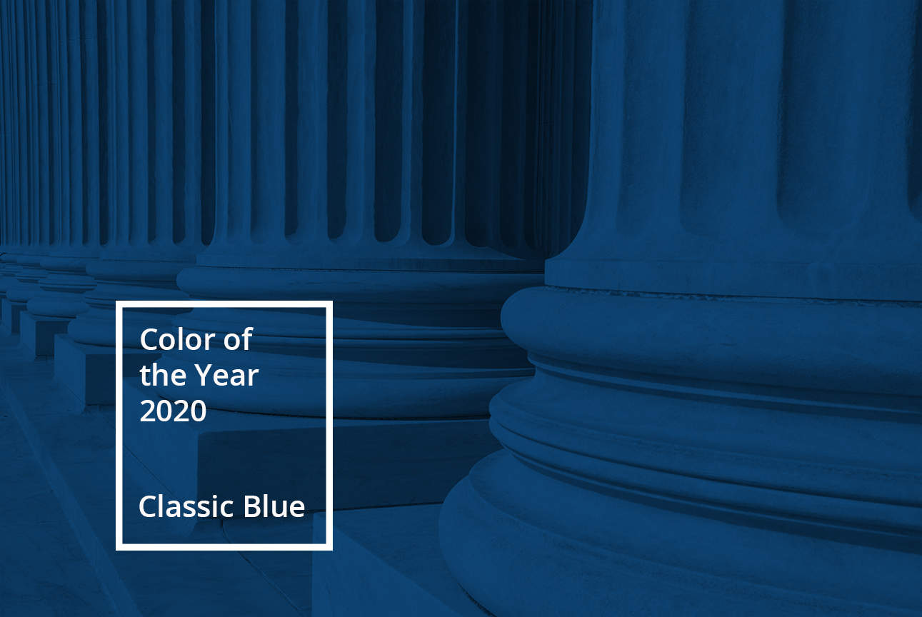
In December the Pantone Color Institute announced its much anticipated 2020 Color of the Year, Classic Blue. A versatile and timeless choice, Classic Blue can be used in law firms’ 2020 marketing efforts to capture the trend and signify a changing industry.
To start a new decade the institute selected a calming hue, describing Classic Blue in its announcement as enduring, dependable and instilling confidence. The legal industry is also embarking on a new era. The technological revolution, increased competition and new competitors continue to influence change; and uncertain economic forecasts necessitate firms develop marketing plans to safeguard client relationships and bolster marketplace awareness.
The best-laid plans will position your firm as enduring, dependable and will instill confidence… sound familiar?
Integrating Classic Blue into 2020 plans will connect your firm with the color’s calm and confident messaging. Consider these three uses:
- Promotional Products. Instead of featuring your logo on a black, grey or white background use Classic Blue. It adds a modern design element to firm promotional products including notebooks, pens, tee shirts, and coffee mugs while maintaining the conservative look of commonly used neutral colors.
- Brand Photography Photo Treatment. Using a Classic Blue color overlay is a simple, impactful way to have firm photos evoke the hue’s characteristics. Whether on your website or in marketing materials, an overlay will add meaning associated with Classic Blue.
- Event Color Palettes. Are you planning a firm retreat or inviting clients to a roundtable? Make the most of Classic Blue’s tranquil qualities by developing your event design color palette around it. Pantone describes the color as thought-providing, aiding concentration and bringing laser like clarity. A Classic Blue-centered aesthetic will set the tone for productive discussion.
Tips for the Best Results:
- Use Classic Blue in moderation. It may support what your organization stands for, however, there is no need to fully convert your existing brand to Classic Blue. Small touches of the color will effectively communicate its qualities, while keeping your firm marketing materials fresh and modern. However, if your firm’s visuals are no longer compelling or have become dated this may be a good time to consider a rebrand.
- Introduce Classic Blue slowly. Similar to our above tip, don’t attempt an overhaul to incorporate it in everything during the first quarter. Organically introduce Classic Blue into marketing materials and branding throughout the year by only using it when it best fits.
- Most importantly don’t adopt Classic Blue for the sake of following a trend. What Pantone deems the Color of the Year may not suit your brand. If Classic Blue doesn’t complement your firm colors or represent your firm identity, don’t force it onto the brand. Maintaining consistency and authenticity will always be more beneficial for your firm.

